
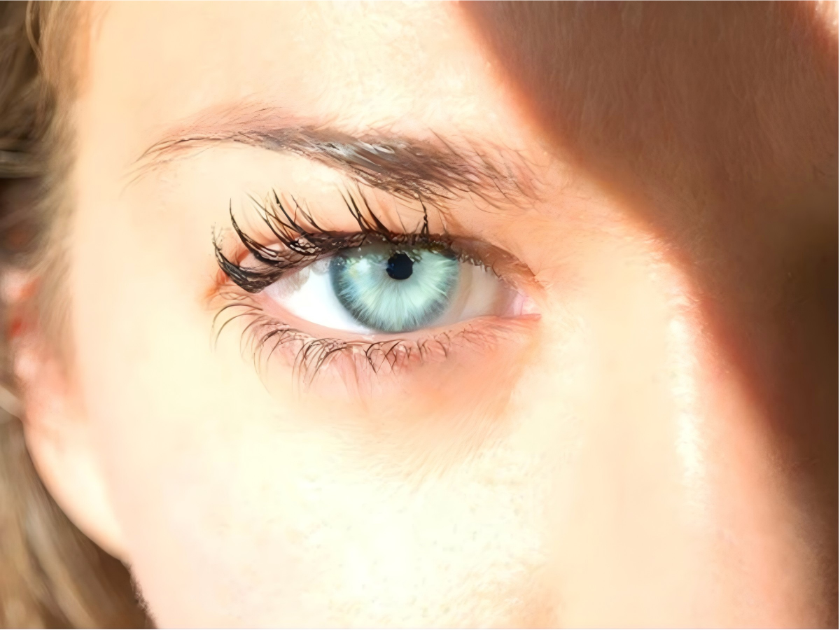
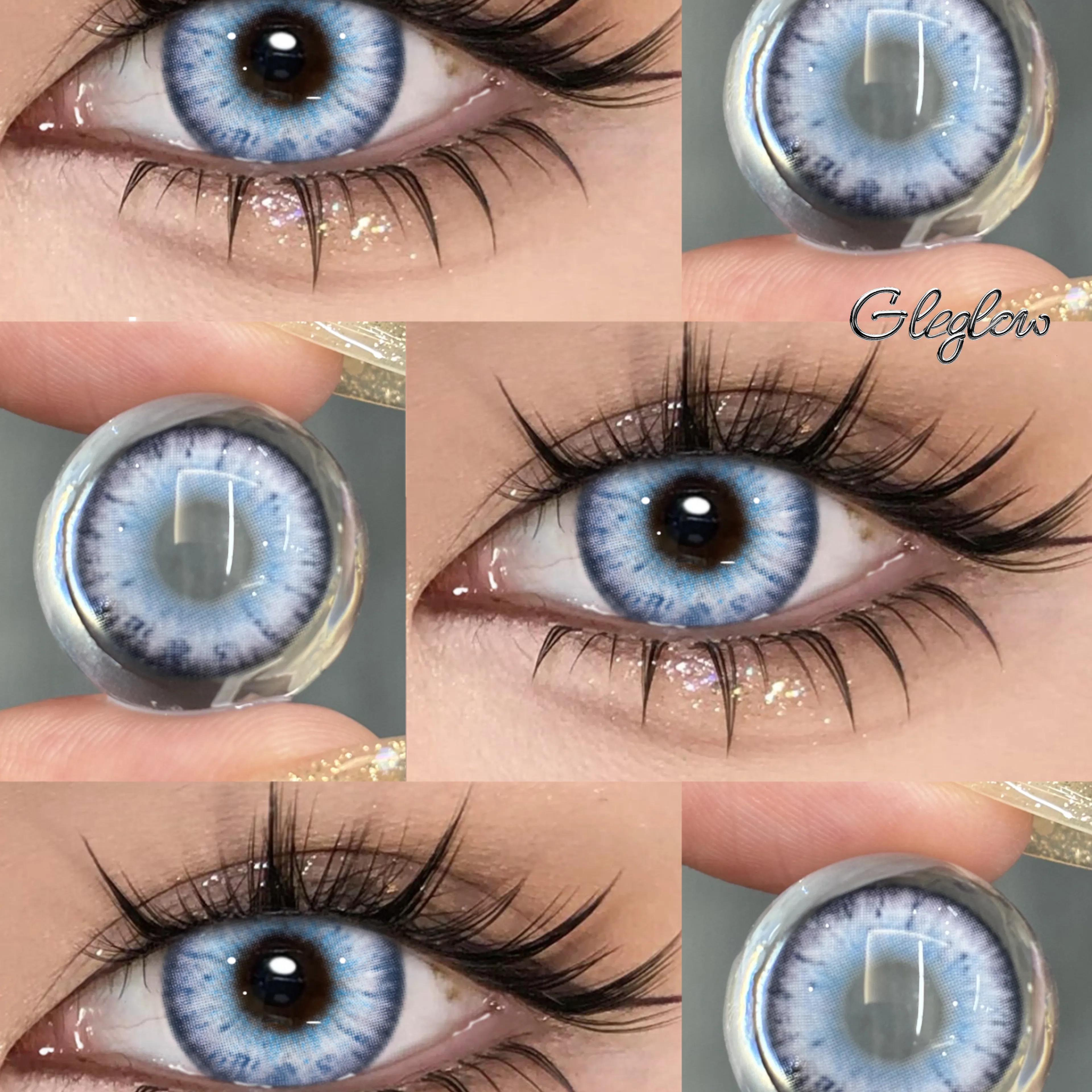
Colored contacts can look different in daylight and indoors. No shade name, opacity category or printed pattern guarantees a natural result in every setting. Compare the specific design on an iris close to yours and decide how much contrast you want.
Daylight Photo Comparison Checklist
| Check | What to compare | Limit to keep in mind |
|---|---|---|
| Starting iris | Look for the wearer’s bare eye color and a depth close to your own. | If it is unknown, the image cannot reliably predict your color change. |
| Direct light and open shade | Compare examples of the same design in direct daylight, open shade and ordinary indoor light where available. | Different exposure, white balance and reflections can alter apparent color. Do not assume all daylight photos use equivalent conditions. |
| Full face and close-up | Use full-face views to judge overall contrast, then inspect the outer ring and transition near the pupil. | A tightly cropped eye image does not show the effect at ordinary conversation distance. |
| Makeup and editing | Look for styling close to your usual routine and information about filters or editing. | Customer photos can also be edited; an image is not a controlled trial. |
| Before and after | Prefer the same wearer, lighting, angle, distance and camera settings where documented. | Different models or conditions make side-by-side comparisons less reliable. |
Compare Design Details Without a Fixed Formula
Inspect the visible printed area, color contrast, outer-ring definition and blend near the pupil together. Medium opacity does not automatically mean realism, and a softer edge or layered pattern cannot guarantee the same result on every eye.
Decide whether you want very little change, more definition or a clear color shift. A pronounced outline or bright color can be an intentional aesthetic choice rather than an error. Keep two candidates and compare them under the most relevant available conditions.
Browse Color Directions
- Grey designs: compare actual daylight brightness and full-face contrast rather than assuming grey always looks more natural.
- Hazel designs: compare the brown, gold and green visible in each particular pattern.
- Brown designs: inspect the amount of change from the original iris; brown is not automatically the safest or most subtle option.
- Green designs: compare the result rather than assigning realism from olive, forest or other shade names.
Browse Gleglow colored contacts for more designs, or use the natural-style selection steps to narrow your comparison. Color is an appearance preference, not a ranking of safety or comfort.
Keep Lens Dimensions and Fit Separate From Styling
Do not change diameter, base curve or prescribed brand to create a smaller or larger visual effect. The printed appearance and clinical fit are different considerations. Professional fitting should establish the exact lens; “moderate enlargement” does not establish comfortable wear.
Before Ordering Your Daylight Shortlist
- Confirm a current contact lens prescription and professional fitting for the exact lens. In the United States, this includes zero-power cosmetic lenses. Read our prescription verification information.
- Check current Power for each eye, specifications, replacement instructions and pack contents. Two lenses are two individual lenses, not two pairs.
- Choose the appearance you prefer among suitable prescribed options, then follow the specific lens and care instructions. A natural-looking photo cannot establish comfortable wearing hours.
Related Comparisons
- Most Realistic Colored Contacts — compare visual design considerations.
- Best Natural Colored Contacts — compare everyday situations and shortlist options.
- Grey Contacts Natural Look Guide — inspect specific grey candidates.
- Natural Colored Contacts for Brown Eyes — compare color directions on brown starting eyes.
If Comparable Daylight Photos Are Missing
Keep the final appearance uncertain rather than treating a shade name or a polished photo as a guarantee. Look for additional product-specific examples before deciding. The most useful shortlist is the one supported by images relevant to your original iris and intended setting.