
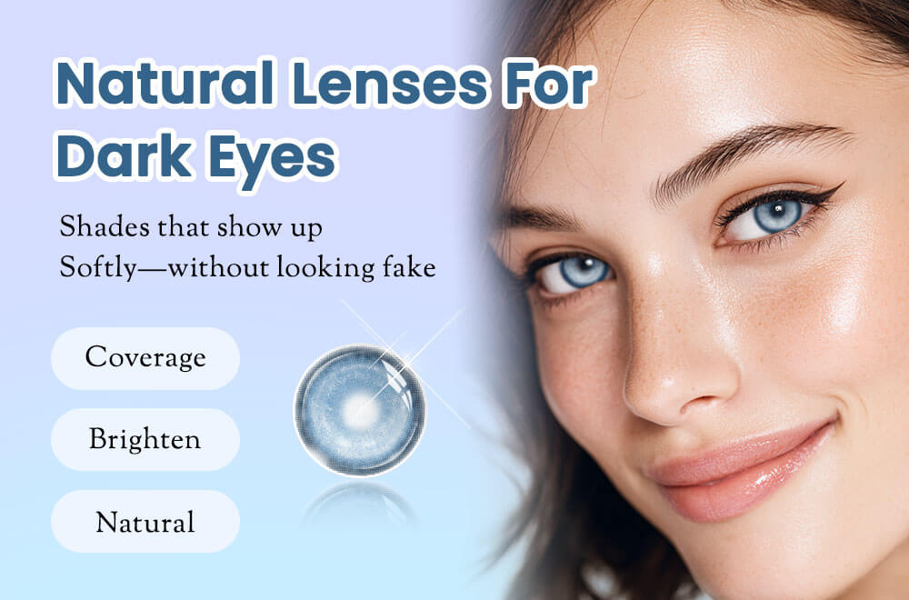
Natural colored contacts on dark eyes can look different from the effect you expected. Before choosing another lens, identify what disappointed you: too little visible color, an obvious outline, a sharp pupil transition or more whole-face contrast than you wanted.
The result depends on the original iris, printed design, lighting and styling. It is not evidence that your eyes are unsuitable or that a whole color family will always look wrong.
Identify the Detail You Want to Change
| What you notice | What to compare next | Useful guide |
|---|---|---|
| The color barely shows | Compare the actual pattern and available photos on a similar starting iris. A pale or muted name does not establish coverage. | Dark brown eyes product comparison |
| The outline looks like a circle | Inspect the printed outer edge and its transition into the original iris. | Subtle design checklist |
| The center looks disconnected | Compare the transition around the pupil in available close-ups, without choosing a smaller optical area for cosmetic effect. | Pattern and transition guide |
| The whole look feels too bright | Compare full-face contrast with your usual makeup and lighting rather than judging only an eye close-up. | Subtle styling without makeup |
Compare Two Products Instead of Changing Everything
Pick one color direction and compare two designs. These GLEGLOW examples are shopping starting points, not an independent ranking or a promise of coverage on every dark iris.
- Brown or hazel direction: compare Dioren Brown with Vaelis Hazel. Both are labeled 1 Year / 2 lenses.
- Grey direction: compare Ivy Grey with Sepia Grey. Both are labeled 1 Year / 2 lenses.
- Green direction: compare Dioren Green with Verdant Origin Green. Both are labeled 1 Year / 2 lenses.
Check current product-page details and available Power options. A color name alone does not tell you how defined the edge or visible the pattern will look. For blue, use the blue contacts for dark brown eyes guide before narrowing the design.
What Photos Can—and Cannot—Tell You
A comparison is more useful when it identifies the wearer's original iris and uses consistent angle, lighting and editing. Brand photos are not a controlled same-wearer trial and cannot establish fit, comfort or your exact result.
Do not interpret “more opacity” as automatically more natural. Inspect the printed texture and both transitions. If apparent enlargement is the concern, read the graphic vs overall diameter comparison; neither size label alone establishes fit.
Keep Appearance Separate From Discomfort
A cosmetic preference is different from discomfort or blurred vision. If you develop discomfort, redness, pain or blurred vision, remove the lenses and contact your eye care professional rather than trying another color as a solution.
Before Ordering Your Next Design
- Confirm a current contact lens prescription and the exact fitted product, including non-corrective colored lenses in the U.S. Use the prescription selection guide.
- Check current specifications and each eye's Power. A matching Power or base curve alone does not make products interchangeable.
- Confirm pack contents, configuration and quantity. Two lenses are not two pairs; verify what to order when your eyes need different powers.
- Check the replacement routine. A yearly label does not mean continuous wear. Compare daily and yearly routines if needed.
- Read customer reviews and prescription shopping information, then recheck product, Power and quantity in the cart.
Compare natural contacts for dark brown eyes · Follow the complete buying checklist